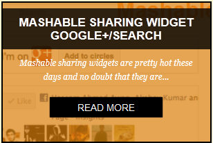
Hello friends, here’s a cool widget feature I’m going to share with you courtesy of Problogger Hassam Ahmad Awan. I was looking for a Blogger application widget when I came across his creation. This CSS3 post widget with zoom mask effect displays great zoom and slide effects once you hover your mouse over it.
The steps are very simple to follow.Step 2 : Add this to your Blogger blog
Step 1: Customizing the widget
<div align='center'>
<div id='background'>
<table>
<tr><td>
<div class='view view-first'>
<img src='First Post Image Link'/>
<div class='mask'>
<h2>First Post Heading</h2>
<p>
First Post Paragraph </p>
<a class='info' href='First Post Link'>Read More</a>
</div>
</div> </td>
<td> <div class='view view-first'>
<img src='Second Post Image Link'/>
<div class='mask'>
<h2>Second Post Heading </h2>
<p>Second Post Paragraph</p>
<a class='info' href='Second Post Link'>Read More</a>
</div>
</div>
</td> <td>
<div class='view view-first'>
<img src='Third Post Image Link'/>
<div class='mask'>
<h2>Third Post Heading </h2>
<p>Third Post Paragraph</p>
<a class='info' href='Third Post Link'>Read More</a>
</div>
</div>
</td>
</tr>
<tr>
<td>
<div class='view view-first'>
<img src='Fourth Post Image Link'/>
<div class='mask'>
<h2>Fourth Post Heading </h2>
<p>Fourth Post Paragraph</p>
<a class='info' href='Fourth Post Link'>Read More</a>
</div>
</div>
</td>
<td>
<div class='view view-first'>
<img src='Fifth Post Image Link'/>
<div class='mask'>
<h2>Fifth Post Heading </h2>
<p>Fifth Post Paragraph</p>
<a class='info' href='Fifth Post Link'>Read More</a>
</div></div>
</td>
<td>
<div class='view view-first'>
<img src='Sixth Post Image Link '/>
<div class='mask'>
<h2>Sixth Post Heading </h2>
<p>Sixth Post paragraph</p>
<a class='info' href='Sixth Post Link'>Read More</a>
</div>
</div>
<p style=" line-height:0px; font-size:8px; font-weight:bold; text-align:right;padding-top:0px;"><a style="color:#D3D3D3;" href="http://www.bloggingehow.com">widgets</a></p>
</td>
</tr>
</table>
</div>
</div>
<style>
#background {
background: #FAF8CC; width:100%; border: 1px solid #C9C299;
}
.view-first img {
-webkit-transition: all 0.2s linear;
-moz-transition: all 0.2s linear;
-o-transition: all 0.2s linear;
-ms-transition: all 0.2s linear;
transition: all 0.2s linear;
}
.view-first .mask {
-ms-filter: "progid: DXImageTransform.Microsoft.Alpha(Opacity=0)";
filter: alpha(opacity=0);
opacity: 0;
background-color: rgba(219,127,8, 0.7);
-webkit-transition: all 0.4s ease-in-out;
-moz-transition: all 0.4s ease-in-out;
-o-transition: all 0.4s ease-in-out;
-ms-transition: all 0.4s ease-in-out;
transition: all 0.4s ease-in-out;
}
.view-first h2 {
-webkit-transform: translateY(-100px);
-moz-transform: translateY(-100px);
-o-transform: translateY(-100px);
-ms-transform: translateY(-100px);
transform: translateY(-100px);
-ms-filter: "progid: DXImageTransform.Microsoft.Alpha(Opacity=0)";
filter: alpha(opacity=0);
opacity: 0;
-webkit-transition: all 0.2s ease-in-out;
-moz-transition: all 0.2s ease-in-out;
-o-transition: all 0.2s ease-in-out;
-ms-transition: all 0.2s ease-in-out;
transition: all 0.2s ease-in-out;
}
.view-first p {
-webkit-transform: translateY(100px);
-moz-transform: translateY(100px);
-o-transform: translateY(100px);
-ms-transform: translateY(100px);
transform: translateY(100px);
-ms-filter: "progid: DXImageTransform.Microsoft.Alpha(Opacity=0)";
filter: alpha(opacity=0);
opacity: 0;
-webkit-transition: all 0.2s linear;
-moz-transition: all 0.2s linear;
-o-transition: all 0.2s linear;
-ms-transition: all 0.2s linear;
transition: all 0.2s linear;
}
.view-first:hover img {
-webkit-transform: scale(1.1,1.1);
-moz-transform: scale(1.1,1.1);
-o-transform: scale(1.1,1.1);
-ms-transform: scale(1.1,1.1);
transform: scale(1.1,1.1);
}
.view-first a.info {
-ms-filter: "progid: DXImageTransform.Microsoft.Alpha(Opacity=0)";
filter: alpha(opacity=0);
opacity: 0;
-webkit-transition: all 0.2s ease-in-out;
-moz-transition: all 0.2s ease-in-out;
-o-transition: all 0.2s ease-in-out;
-ms-transition: all 0.2s ease-in-out;
transition: all 0.2s ease-in-out;
}
.view-first:hover .mask {
-ms-filter: "progid: DXImageTransform.Microsoft.Alpha(Opacity=100)";
filter: alpha(opacity=100);
opacity: 1;
}
.view-first:hover h2,
.view-first:hover p,
.view-first:hover a.info {
-ms-filter: "progid: DXImageTransform.Microsoft.Alpha(Opacity=100)";
filter: alpha(opacity=100);
opacity: 1;
-webkit-transform: translateY(0px);
-moz-transform: translateY(0px);
-o-transform: translateY(0px);
-ms-transform: translateY(0px);
transform: translateY(0px);
}
.view-first:hover p {
-webkit-transition-delay: 0.1s;
-moz-transition-delay: 0.1s;
-o-transition-delay: 0.1s;
-ms-transition-delay: 0.1s;
transition-delay: 0.1s;
}
.view-first:hover a.info {
-webkit-transition-delay: 0.2s;
-moz-transition-delay: 0.2s;
-o-transition-delay: 0.2s;
-ms-transition-delay: 0.2s;
transition-delay: 0.2s;
}
.view {
width: 300px;
height: 200px;
margin: 10px;
border: 2px solid #000000;
overflow: hidden;
position: relative;
text-align: center;
-webkit-box-shadow: 1px 1px 2px #e6e6e6;
-moz-box-shadow: 1px 1px 2px #e6e6e6;
box-shadow: 1px 1px 2px #e6e6e6;
cursor: default;
background: #fff url(../images/bgimg.jpg) no-repeat center center;
}
.view .mask,.view .content {
width: 300px;
height: 200px;
position: absolute;
overflow: hidden;
top: 0;
left: 0;
}
.view img {
display: block;
position: relative;
}
.view h2 {
text-transform: uppercase;
color: #fff;
text-align: center;
position: relative;
font-size: 17px;
padding: 10px;
background: rgba(0, 0, 0, 0.8);
margin: 8px 0 0 0;
}
.view p {
font-family: Georgia, serif;
font-style: italic;
font-size: 12px;
position: relative;
color: #fff;
padding: 10px 20px 20px;
text-align: center;
}
.view a.info {
display: inline-block;
text-decoration: none;
padding: 5px 40px ;
background: #000;
color: #fff;
text-transform: uppercase;
-webkit-box-shadow: 0 0 1px #000;
-moz-box-shadow: 0 0 1px #000;
box-shadow: 0 0 1px #000;
}
.view a.info: hover {
-webkit-box-shadow: 0 0 5px #000;
-moz-box-shadow: 0 0 5px #000;
box-shadow: 0 0 5px #000;
}
</style>
Go to Blogger Dashboard > Design > Add a Gadget.
Another option is to add directly to your template via the Edit HTML option.
Also, check out his demo video:
0 comments:
Post a Comment